The art of tumbling your way to the polls
A website for #GoVote and #Vota artwork to help increase turnout and momentum for the 2014 election and beyond.
When hundreds of amazing artists come together to make art to encourage you to vote, it’s a pretty special thing. This project all started on a call with TaskForce’s Yosi Sergant, which in my experience, always leads to something worth telling the world about.
I created some artwork for the original #GoVote project in 2012. This year we were asked to redesign the website. It’s expected to be home to more than 400 images by November 4th. The goal: to drive voter participation utilizing inspiring creativity for the good of America.
The original site was on Tumblr. It used a basic theme that did the job. Due to a variety of factors, including a pretty fast timeline and tight budget, keeping it on Tumblr was the best way for the new site to move forward. We’d just create our own custom theme. This allowed us to keep the extensive 2012 archive on a user-friendly, reliable platform. There were, of course, limitations with this approach, but nothing that would get in the way of the goal.
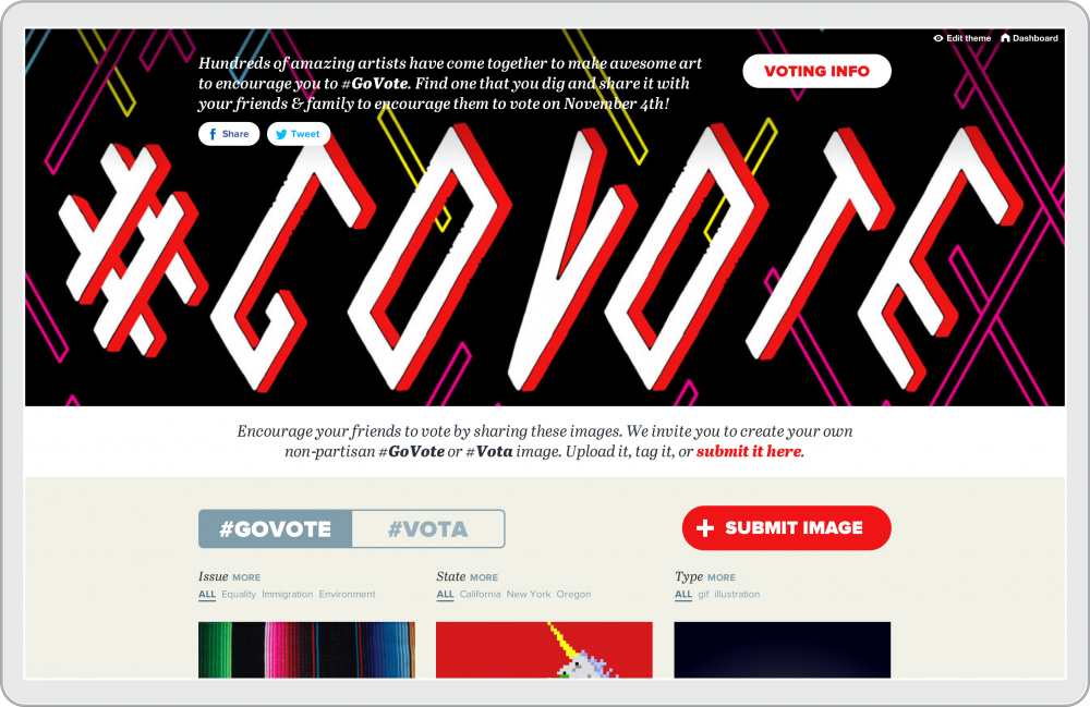
The list of requirements included responsive design, a clear line between #GoVote and #Vota, granular sorting options, obvious sharing calls-to-action and an emphasis on submitting your own artwork. Also very important was a quick way to get to the very robust hub for voter info created by HeadCount.
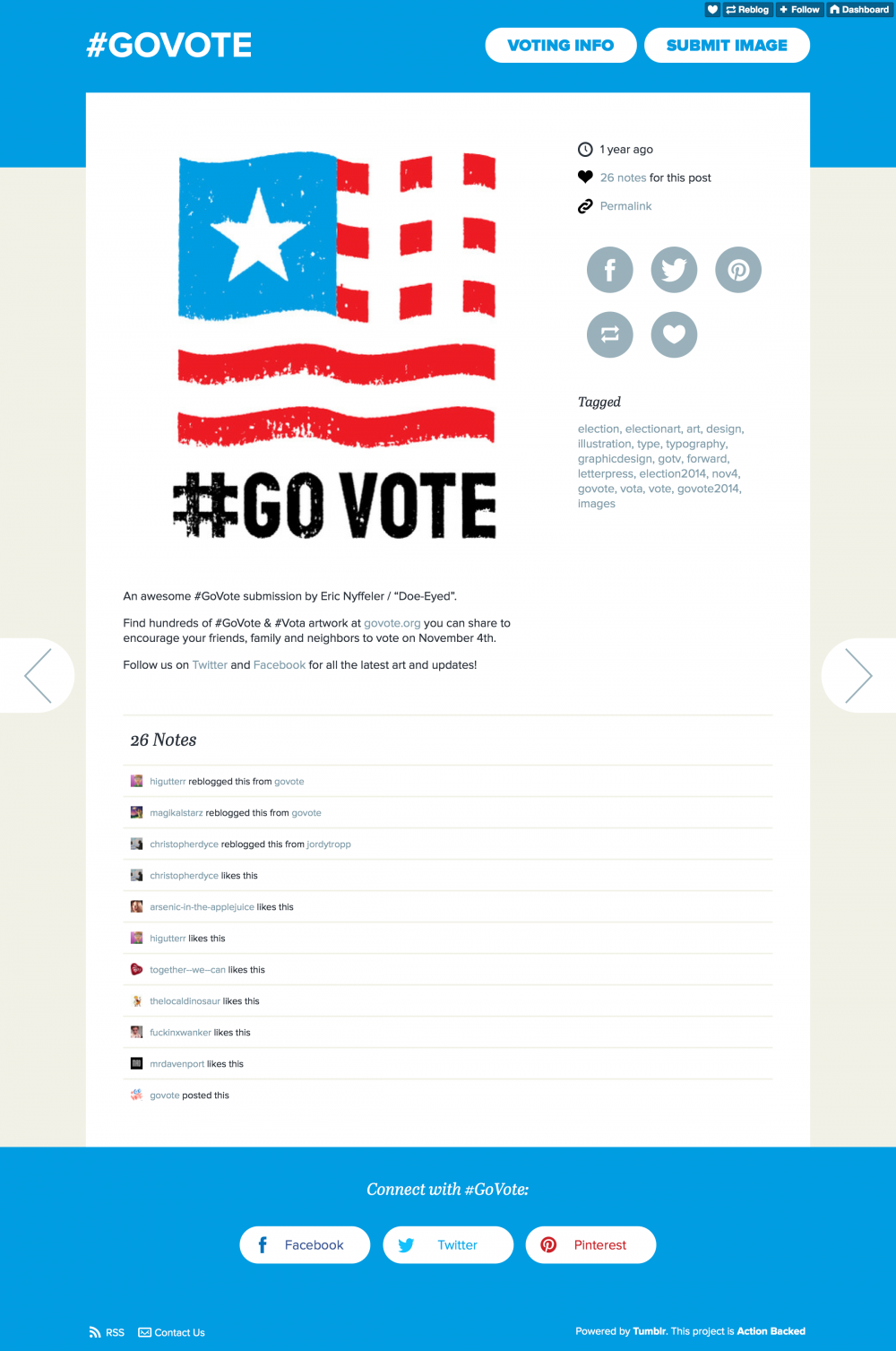
Getting into the brand design process, there was some initial talk about creating a visual identity. A logomark of some kind. A type treatment for #GoVote. Or a standard red, white and blue color palette. What was ultimately decided is that the project itself is its own visual identity.
Now, let’s be clear. The artists and designers who have contributed artwork to #GoVote are no slouches. Shepard Fairey, Dan Cassaro, Mear One, Jennifer Daniel, Josh Higgins, Jesse LeDoux, Mary Kate McDevitt, Doe-Eyed, Sam Flores, Amy Martin and the list goes on and on. So when it came to the site design, we let the art do the talking.
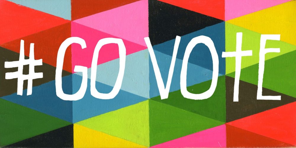
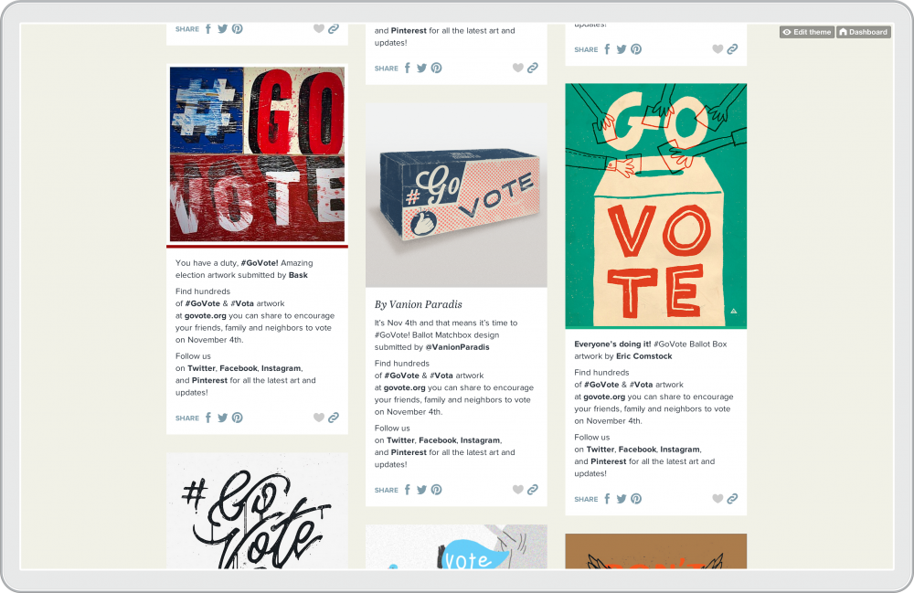
When you first land on the site, the art hits you. A beautiful, full-width image not only sets the tone but can be easily swapped out to keep the site feeling fresh. We launched with Lisa Congdon’s colorful triangles as they capture a certain feeling at the heart of the project. There’s a beauty to the #GoVote message that transcends a typical piece of voting communication. DIY lettering for the roll-up-your-sleeves nature of participatory democracy. A vibrant patchwork for the multicultural, full color worldview of America. From there, three columns of cascading visuals take you down the page.
There’s a simple utility to the site design. Clean and flat. Just the right amount of supporting text. A subtle palette of secondary colors. Social actions at every turn for ease of sharing on any device. As for the primary action color, it’s determined based on the homepage’s featured artwork. For Lisa’s piece, a vibrant magenta. With Jesse LeDoux, a bright cyan.
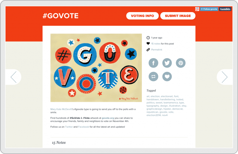
For each image uploaded, alongside a host of issue, state and type tags, a primary color tag is added in Tumblr. This applies to the small color bar in the image feed. On the image detail page, this color takes over the header and footer creating a unified presentation of the artwork.
The custom theme we built on Tumblr is fully responsive, fast, and clean. While you lose a bit of flexibility using a platform such as Tumblr, you also gain a lot of built-in functionality for “free.” This allowed us to have comments (via Tumblr “notes”), reblogging, likes, a submission form and more without having to build key features from scratch.
The team at TaskForce has been and will continue to be the muscle behind the site. Constantly adding, sharing and curating the artwork. Connected to all the appropriate social media networks and committed to getting you excited about voting. Keep an eye out for what’s next for the project in 2016.
